Responsive, accessible navigation 5: HTML structure
08 Feb 2021
Table of Contents
Having taken apart a lot of other navbars, here’s one structure for my nav.liquid 11ty template that I think might work.
TBD if it makes more sense to have #topnav or .topnav__body get the nav tag – I’ve seen it both ways (the latter in Stackbit’s Exto theme).
Nesting structure
- header#masthead
- div.contained.contained--lg
- nav#topnav.topnav.grdGrid.-middle.-between
- div.topnav__header.grdCell
- div.grdGrid.-middle.-between
- a#brandingLogo.topnav__header__actionable.grdCell
- button.topnav__hamburger
- span.topnav__header__actionable.grdCell
- div.grdGrid.-middle.-between
- div.topnav__body.grdCell.-fill
- a#loop1.topnav__body__outeritem.topnav__body__actionable
- div#loop2.topnav__body__outeritem.topnav__dropdown
- button.topnav__dropdown__button
- span.topnav__body__actionable
- div.topnav__dropdown__items
- a.topnav__body__actionable
- a.topnav__body__actionable
- a.topnav__body__actionable
- button.topnav__dropdown__button
- a#loop3.topnav__body__outeritem.topnav__body__actionable
- a#loop4.topnav__body__outeritem.topnav__body__actionable
- div.topnav__header.grdCell
- nav#topnav.topnav.grdGrid.-middle.-between
- div.contained.contained--lg
The “loop” IDs wouldn’t actually be in my HTML output – my bulleted list in this post was just getting hard to read and I wanted to remember the level of HTML nesting at which my static site generator starts inserting actual menu items.
The grdGrid and grdCell classes (and their hyphenated followup classes) come from slightly-renamed copies of the CSS definitions in Shogo Sensui’s Grd framework.
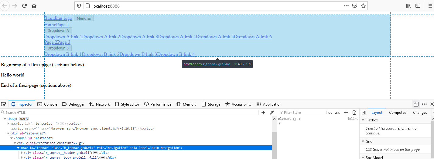
How it looks
With no CSS styling on the classes particular to nav.liquid included yet, here’s what that looks like:
Walkthrough
- “Branding logo” is an
A(default inline display), and “Menu ☰” is aBUTTON(default inline-block display), so they appear on the same line. - Then we jump to a new line because the
DIV(.topnav__header) containing those 2 elements has closed out and a new one has begun (.topnav__body), andDIVs default to block display. - “Home” and “Page 1” are both
As (default inline), so they appear on the same line. No one told them they had to have space between each other, so they don’t. - “Dropdown A” is a
BUTTON(default inline-block), but it’s in aDIVof its own, so it appears on the next line. - “Dropdown A link 1” through “Dropdown A link 6” are
As (default inline), so they all appear on the same line as each other. They’re surrounded by yet another DIV, so they get a line separate from “Dropdown A.” No space between them. - “Page 2” and “Page 3” are both
As (default inline), so they appear on the same line. All the DIVs for “Dropdown A” have been closed out by now, so we’re on to a new line. - “Dropdown B” and its children display according to the same explanations as “Dropdown A” and its children.
Template code
Here’s the old Eleventy Liquid code for nav.liquid:
<header id="masthead">
  <div class="contained contained--lg">
    Masthead goes here
  </div>{%- comment -%}End div.contained{%- endcomment -%}
</header>
And here’s the new nav.liquid that actually puts links onto a page:
<header id="masthead">
<div class="contained contained--lg">
<nav role="navigation" aria-label="Main Navigation" id="topnav" class="topnav grdGrid -middle -between">
<div class="topnav__header grdCell">
<div class="grdGrid -middle -between">
<a href="/" id="brandingLogo" class="topnav__header__actionable grdCell">
Branding Logo
</a>
<button type="button" class="topnav__hamburger">
<span class="topnav__header__actionable grdCell">
Menu ☰
</span>
</button>
</div>{%- comment -%}End div.topnav__header{%- endcomment -%}
</div>{%- comment -%}End div.grdGrid{%- endcomment -%}
<div class="topnav__body grdCell -fill">
{%- for link in site.mainNavLinks -%}
{%- if link.sublinks == blank or link.sublinks.size == 0 -%}
<a href="{{ link.url }}" class="topnav__body__outeritem topnav__body__actionable">
{{ link.text }}
</a>
{%- else -%}
<div class="topnav__body__outeritem topnav__dropdown">
<button class="topnav__dropdown__button">
<span class="topnav__body__actionable">
{{ link.text }}
</span>
</button>
<div class="topnav__dropdown__items">
{%- for sublink in link.sublinks -%}
<a href="{{ sublink.url }}" class="topnav__body__actionable">
{{ sublink.text }}
</a>
{%- endfor -%}
</div>
</div>{%- comment -%}End div.topnav__dropdown{%- endcomment -%}
{%- endif -%}
{%- endfor -%}
</div>{%- comment -%}End div.topnav__body{%- endcomment -%}
</nav>
<div style="clear: both;"></div><!-- TO DO: FIX ME-->
</div>{%- comment -%}End div.contained{%- endcomment -%}
</header>
Finally, toward the end of article #5 of this series, I’m ready to start thinking about how my nav bar looks and behaves. Phew!
Flexbox
I mentioned using Shogo Sensui’s Grd framework for simple responsive alignment of of things using CSS flexbox: I’ll now install it (see GitHub commit).
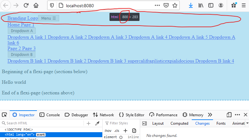
All I’ve done with Grd thus far in the HTML template is float the “branding” & “hamburger” off to the left, and the “navigation menu proper” over to the right, on 801px-and-up screens.
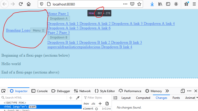
I let the “branding+hamburger” part of the nav go up above the “nav menu proper” on 800px-and-smaller screens.
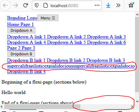
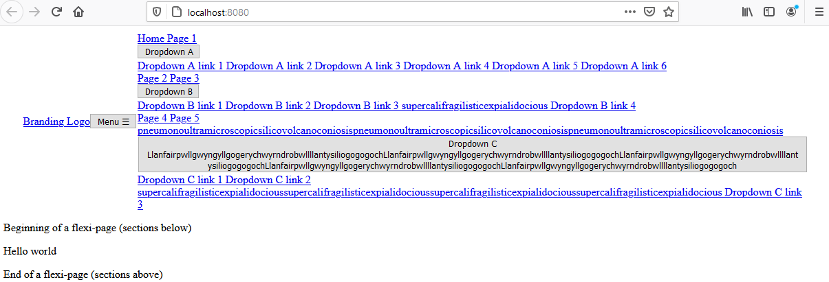
If I change supercalifragilisticexpialidocious (part of the data for drop down B, link 3 – sorry, forgot to include it in the first screenshot) to repeat 3 times w/ no spaces, I do force a horizontal scrollbar to appear, but that’s been an issue since my very first version of the page – I just forgot to screenshot it.
Text wrapping
Let’s fix that:
I’m going to add a few extremely long items to site.js:
...
    { url: "/page4/", text: "Page 4" },
    { url: "/page5/", text: "Page 5 pneumonoultramicroscopicsilicovolcanoconiosispneumonoultramicroscopicsilicovolcanoconiosis" },
    {
      text: "Dropdown C LlanfairpwllgwyngyllgogerychwyrndrobwllllantysiliogogogochLlanfairpwllgwyngyllgogerychwyrndrobwllllantysiliogogogochLlanfairpwllgwyngyllgogerychwyrndrobwllllantysiliogogogochLlanfairpwllgwyngyllgogerychwyrndrobwllllantysiliogogogochLlanfairpwllgwyngyllgogerychwyrndrobwllllantysiliogogogoch",
      sublinks: [
        { url: "/dcl1/", text: "Dropdown C link 1" },
        { url: "/dcl2/", text: "Dropdown C link 2 supercalifragilisticexpialidocioussupercalifragilisticexpialidocioussupercalifragilisticexpialidocious" },
        { url: "/dbl3/", text: "Dropdown C link 3" },
      ],
    },
...
I’ll start up my _nav.scss SASS file now and give it the following code:
.topnav__dropdown__button {
  max-width: 100%;
}

.topnav__body__actionable {
  overflow-wrap: break-word;
}
That’s better:
Now comes the hard part – actually making the nav menu do … nav-menu-ey … stuff. Stay tuned.

Posts In This Series
- Part 1 - Responsive, accessible navigation 1: Intro
- Part 2 - Responsive, accessible navigation 2: 11ty
- Part 3 - Responsive, accessible navigation 3: Constraining width
- Part 4 - Responsive, accessible navigation 4: Preventative troubleshooting
- Part 5 - This Article
- Part 6 - 11ty Markdown -- group pets by color
