Responsive, accessible navigation 3: Constraining width
08 Feb 2021
Before I actually put any navigational data into my masthead, I want to play with constraining its width.
Deciding how wide it should be
While I wish I could train myself to design “mobile first,” my broadsheet-trained brain always imagines a wide desktop area “above the fold” first.
I decided that “desktop mode” layouts I admired broke down into 3 styles:
| Masthead background | Masthead text | Main-body text | Examples, as of late 2020 |
|---|---|---|---|
| To the screen’s edge | To the screen’s edge | Fixed max width | Stackrole Foundation theme, Katie Kodes |
| To the screen’s edge | Fixed max width | Fixed max width | Stackbit Starter theme, Stackbit Ampersand theme, Stackbit Exto theme (it’s subtle – just a bottom-border line) |
| Fixed max width | Fixed max width | Fixed max width | Stackbit DIY theme, The Minimalists |
I couldn’t decide what I really liked, so I polled the Party Corgi Discord.
Brittney Postma pointed out that letting sections within the main body of a web page sporadically go “full bleed” to the screen’s edge for emphasis as seen this post by Josh Comeau can look awkward without at least letting the masthead’s looks a bit silly without a header that at least letting the masthead’s background stretch to the edge of large screens, so I should stay away from approach #3 if I thought I might want to have such elements in my down-page designs. That said, I noticed that Bandcamp makes it work.
It feels easier to be aesthetically pleasing with ample use of whitespace, so I’m going to play with option #3.
Constraining width with CSS
Naming things
Two common CSS class name to assign HTML block elements meant to constrain width, particularly in the context of a cohesive look-and-feel for “max page width,” are container and inner.
There’s something that’s just not clicking for me about either of those two names.
The word “contained,” though – that’s feeling right.
I’m going to edit nav.liquid to read like this:
<header id="masthead">
  <div class="contained contained--lg">
    Masthead goes here
  </div>{%- comment -%}End div.contained{%- endcomment -%}
</header>
(I like what Stackbit did in a lot of their themes with the contained class taking care of one thing and a secondary contained--SizeAbbreviation class taking care of the actual number of pixels for max-width.)
Code
I sprinkled some SCSS into my _*.scss files as follows:
$contained-padding-lr: 1.125rem;
.contained {
  margin-left: auto; // Center "contained" (non-full-bleed) content within its space
  margin-right: auto; // Center "contained" (non-full-bleed) content within its space
  max-width: 100%; // Make sure "contained" (non-full-bleed) content can't overflow its space left-right
  padding-left: $contained-padding-lr; // Bring "contained" (non-full-bleed) content in from the edges a bit, for looks
  padding-right: $contained-padding-lr; // Bring "contained" (non-full-bleed) content in from the edges a bit, for looks
}
$width-xs: 360px !default;
$width-sm: 460px !default;
$width-md: 740px !default;
$width-lg: 1140px !default;
$width-xl: 1400px !default;
.contained--lg {
  max-width: $width-lg; // If a flexi-content section has this class too, give it a pixel-based max-width
}
(GitHub change 1 & GitHub change 2)
Results
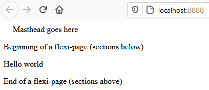
Here’s what my page looks like when I only assign the contained class to my div:
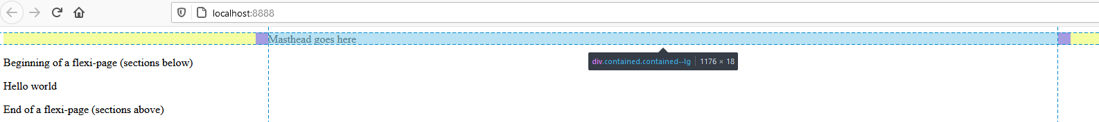
And here it is when I also assign it contained--lg:
I can reuse the concept of contained and contained--lg all up and down a web page, not just in the masthead. For now, I’ll only do it in the masthead so that I can see the impact I’m making.

Posts In This Series
- Part 1 - Responsive, accessible navigation 1: Intro
- Part 2 - Responsive, accessible navigation 2: 11ty
- Part 3 - This Article
- Part 4 - Responsive, accessible navigation 4: Preventative troubleshooting
- Part 5 - Responsive, accessible navigation 5: HTML structure
- Part 6 - 11ty Markdown -- group pets by color
