Responsive, accessible navigation 4: Preventative troubleshooting
08 Feb 2021
Before I go any further (yup, there’s still no nav data in my navbar!), I should think through some issues that might come up as I try to implement a navbar.
Quality control
Everything should navigate smoothly and present sensible visual and audio (screen reader) UI whether navigating by keyboard, mouse, or touchscreen, and whether in “big screen” or “small screen” presentation.
Small screens
What should my masthead look like on a “small” screen? I’m going to try to keep things simple:
- Leave the branding logo at the top left.
- If the menu items will be hideable, put the phrase
Menu ☰at the top right as a control for hiding and un-hiding. - Let each menu item take up the full screen width.
- If the menu has 2 levels, make it obvious which level is which, and whether the label for sub-menus is actually supposed to do anything when you click it.
You’re so wordy, Katie
On a wide screen, I know that I like the look of a classic “branding logo at left, nav items at right” split to a masthead.
The problem is … what do “left” and “right” mean when a content author overeagerly edits the navigation options?
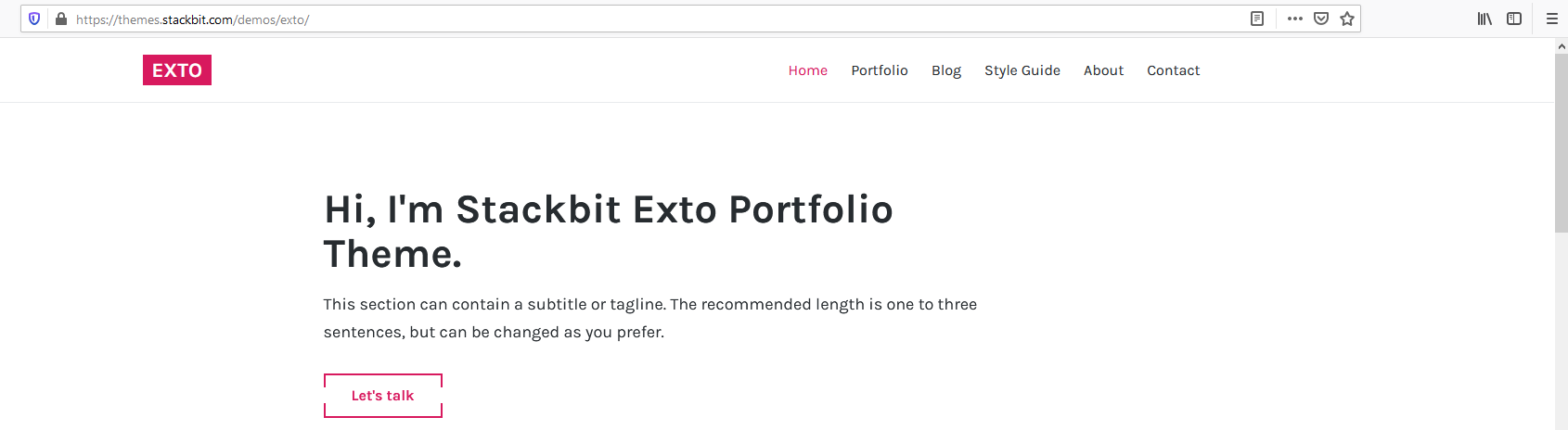
Stackbit’s Exto theme looks pretty good as demonstrated:
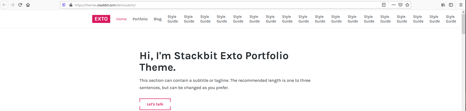
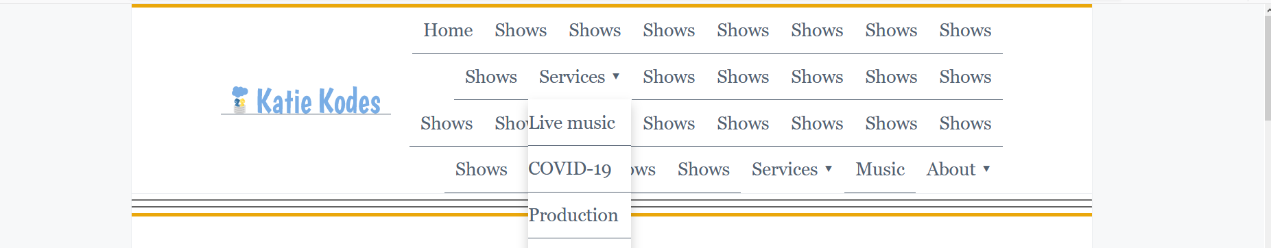
But duplicating one of the items excessively with Firefox’s Developer Console (to imitate an overeager web site author), it turns out I can make the content simply flow off the page, without any scrollbars in sight to help me find it.
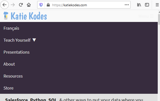
In fact, I failed to follow Stéphanie Walter’s points from Designing Adaptive Components, Beyond Responsive Breakpoints when I added “Store” to my own site – here’s one of the few magic screen-widths where it wraps awkwardly below my logo:
One idea is to go with a 1-row, 2-column layout for the masthead, vertically centering the contents of each cell within the masthead.
It’s not ideal, but I think it seems functional.
And touchy, too
Over at The Minimalists, which I found through Adam Silver’s Designing a responsive menu without a hamburger, “About” is both the header for a hover drop-down and a link to a new page.
That makes it very difficult to access the secondary menu items from a large touchscreen monitor.
In fact, it looks like they even use hover for small screens, which are usually touchscreens, so there’s a pretty noticeable amount of their navigation menu I can’t use from my phone.
Particularly if a top-level menu item can serve as a link and as a UI control at the same time, it needs to have intuitive click/keyboard options for the UI controls.
Last but not least
When making a hovering dropdown 2nd level to a navigation menu, it’s often nice to set a generous minimum width for the 2nd-level content so that people don’t have trouble moving their cursor to it or fail to notice it.
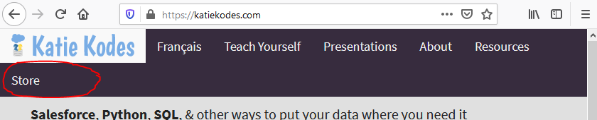
You can see here that the drop-down under “Teach Yourself” on my own site is wider than the phrase “Teach Yourself”.

But what if a content author does awkward things with a drop-down menu, like put it as the last item on the right, or do strange things with the amount of text?
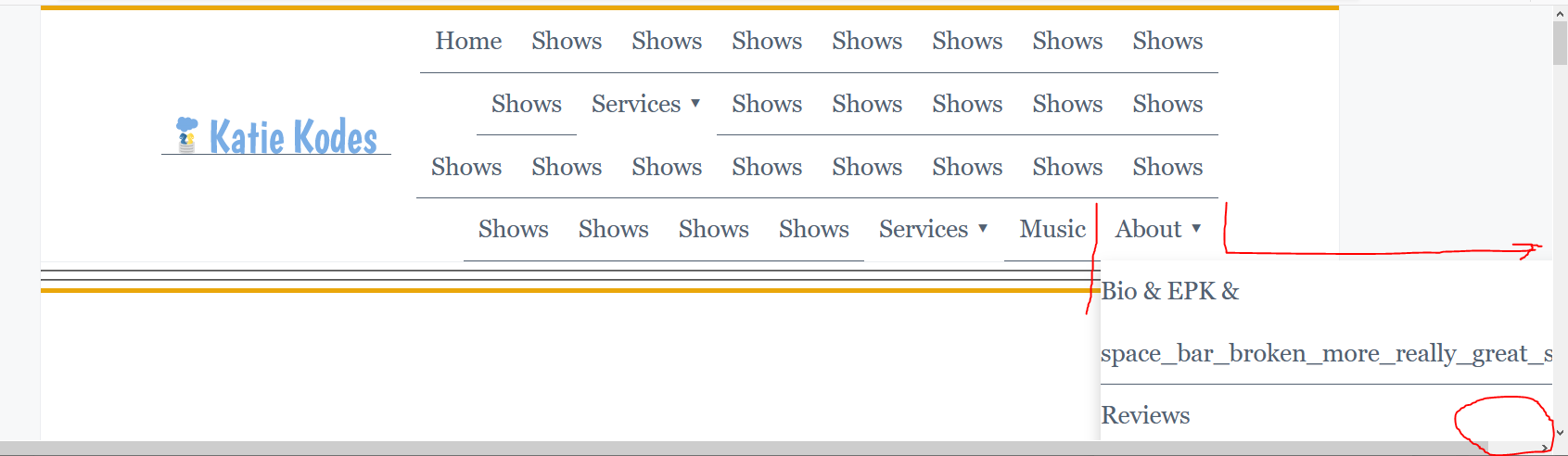
I don’t have a good answer for this. I’m not enough of a CSS whiz to really get my mind around how to account for the complexities of absolute positioning and awkward content in a way that looks good.

Posts In This Series
- Part 1 - Responsive, accessible navigation 1: Intro
- Part 2 - Responsive, accessible navigation 2: 11ty
- Part 3 - Responsive, accessible navigation 3: Constraining width
- Part 4 - This Article
- Part 5 - Responsive, accessible navigation 5: HTML structure
- Part 6 - 11ty Markdown -- group pets by color
