Responsive, accessible navigation 1: Intro
08 Feb 2021
Table of Contents
I have a “dream nav bar” in mind, but building it is another issue. Follow me on a journey through building a minimalistic, accessible, responsive 2-level top-of-site navigation menu.
Posts In This Series
- Part 1 - This Article
- Part 2 - Responsive, accessible navigation 2: 11ty
- Part 3 - Responsive, accessible navigation 3: Constraining width
- Part 4 - Responsive, accessible navigation 4: Preventative troubleshooting
- Part 5 - Responsive, accessible navigation 5: HTML structure
- Part 6 - 11ty Markdown -- group pets by color
Requirements
- It needs to look good on mobile and desktop.
- No weird visual bugs at any screen/window size, no matter what length content (e.g.
supercalifragilisticexpialidocious) a site author types into the nav’s labels. - All elements need to be big enough for shaky hands to touch / click
- It needs to work well with a mouse or with a touchscreen at all screen/window sizes
- It needs to work well when navigating by keyboard, both “forward” and “backward” through its items
- It needs to be screen-reader friendly, both “forward” and “backward” through its items
- It needs to be visually accessible when navigating through its items (so that you know what you’re looking at before you “click” it), whether by keyboard, mouse, voice command, touchscreen, etc.
- It needs to work just fine w/ JavaScript turned off, even if it’s not as pretty
- It needs to be visually pleasing enough that I’m not embarrassed to put it on a real web site
Git repository
See all my steps & missteps on GitHub
Pictoral highlights
Wireframe, screens where nav has every element 100% width (e.g. small screens):
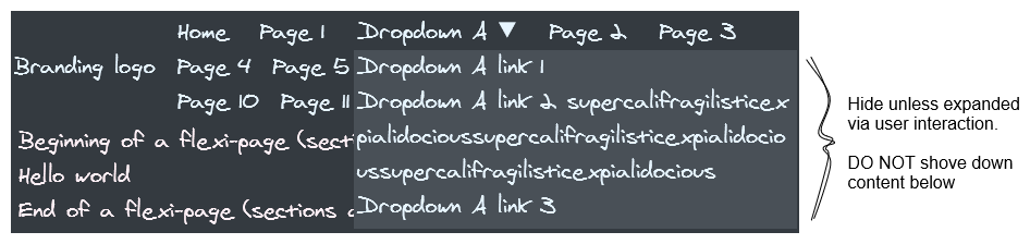
Wireframe, screens where nav elements try to be side-by-side (e.g. big screens, but maybe also big screens w/ JavaScript diabled):
1st render:
1st insert of data:
1st use of flexbox, wide screen:
And narrow screen:
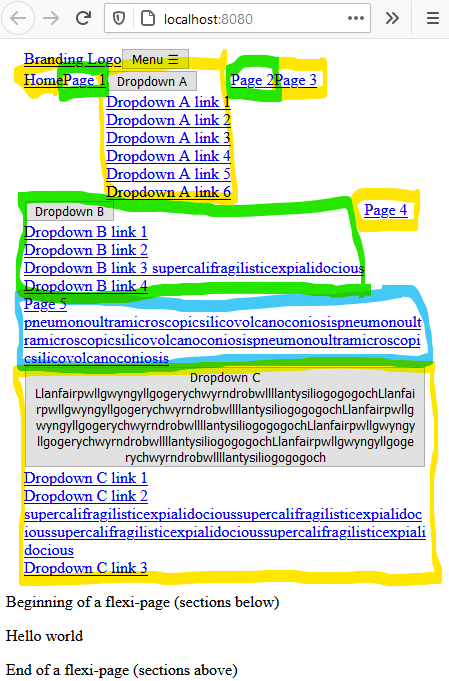
Some more flexbox, plus making A elements display:block, big screen:
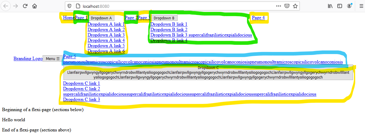
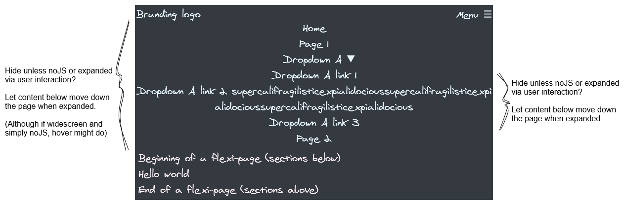
And small screen: