Choosing a headless CMS without losing your head
24 Aug 2020

Table of Contents
Snap judgments about whether I’d ask my grandparents to use a variety of content management systems (CMSes) popular in the world of static website management:
- Agility
- Contentful
- DatoCMS
- Forestry
- Kentico Kontent
- Magnolia
- Netlify CMS
- Prismic
- Sanity
- Stackbit
- TakeShape
- TinaCMS
I’d like to build a beautiful, performant, highly customizeable website for a musician.
At $160/year, Bandzoogle is a great website builder. Squarespace, Wix, Weebly, and more all offer great value as well. I should stop there. But honestly, who can convince a developer to buy instead of build?
Note: This article is under construction – possibly never to be finished – but in the spirit of “digital gardening,” I’m going to post it now in case the content I’ve written so far is useful to one other person in the universe.
I’d love to see your thoughts in the comment section – let’s make this an open forum!
lol, it seems this post has taken off and been useful without me ever fully completing it. Did you pick a CMS you love? If you’d like, I’d love a Ko-Fi. (Chai for me!) 🥰
Requirements
Self-serve beauty (model complexity)
The number one requirement I have for a CMS is that it facilitates intuitively adding, removing, and rearranging components not only within web pages, but nested inside other components on a page. This ensures as close to a website builder experience as it’s possible to build, which I believe is essential for non-technical yet highly artistic-minded authors who only love a user interface when they can use it to play with the look and feel of their web site.
It needs to be intuitive to work with simple and complex components like:
- Video players
- Stylized images
- Content lists
- Heroes
- Content galleries
- Features
- Call to action buttons
- Call to action panels
- Testimonial clusters
- Blog post preview clusters
If I want to do this:
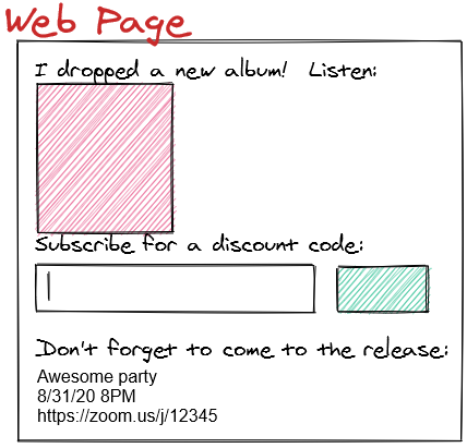
I don’t want a content author to have to memorize a bunch of shortcodes.
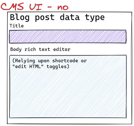
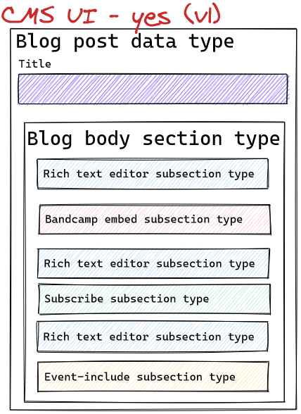
I need the CMS to support really great data-structure rearranging.
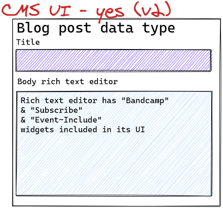
Or, alternatively, a rich text editor with customizeable “sub-widgets” could achieve the same goal:
I need a CMS that can manage not only “lists” and “objects” of simple data types as page elements, but “lists of lists,” “objects containing objects,” “objects containing lists,” and “lists of objects” (allowing restrictions on object type, but also allowing multiple valid object types) – preferably with no limitation on the nesting depth.
Despite such complexity, a non-technical author should find the CMS’s graphical user interface for manipulating these data structures extremely intuitive. Don’t make authors think.
Free data – lots of it
Some university professors wield 10-page C.V.s listing hundreds of published works. Similarly, to certain audiences, it’s a selling point to show “receipts” for a 20-year career playing 200-300 shows a year at weddings, conferences, festivals, and on television. A mile-long “past events” calendar, tucked neatly out of the way, makes a nice, gentle humble-brag available to reassure the kind of potential client who would go poking around such a page.
20 x 250 = 5,000 “event” data points and counting, plus hundreds of related “venue” records. To last until the next site migration, a “database” of these events should allow tens of thousands of records to be managed for free with limits that support nightly site rebuilds (to flip events from “upcoming” to “past” listings as they occur in the real world).
Live preview support
Whether by having a separate “drafts” API (à la Sanity) or by hosting miniature web servers inside the CMS (à la Forestry), it should be easy for an author to see how the web site would look when they make changes in the CMS but haven’t yet “published” them.
Accident protection
An ideal CMS would allow 2 users – one admin and one author – in its free tier so that authors can make content changes without breaking the content data model / schema.
Neither role’s user interface should risk damaging configuration files or templates needed by the static site generator (SSG).
Bus factor
The schema provided to the CMS should be configurable through a graphical user interface.
If something happens to me, a non-technical author should be able to log into the CMS with admin credentials and muddle through changing the content model.
Backup
It should be free and easy to back up and restore not only the content, but preferably also its schema, for:
- emergency restoration into the same CMS
- migration into a new CMS
Mobile friendly
Optionally, editing content from a smartphone could be handy.
Strict
The more granularly the CMS can provide an intuitive and strict experience to guide correct data entry, the better.
String pattern validation, picklists, help text, limits on list length, hidden fields, default values, inter-field dependencies, etc.
Summary
My highly unscientific skim of CMSes resulted in the following findings:
| Agility | Contentful | DatoCMS | Forestry | Kontent | Magnolia | NetlifyCMS | Prismic | Sanity | Stackbit | TakeShape | TinaCMS | ||
|---|---|---|---|---|---|---|---|---|---|---|---|---|---|
| Where? | API | API | API | Git | API | API (DIY) | Git | API | API | either | API | Git | Where? |
| Shortlist | N | N | N | Y | N | N | Y | N | Y | Y | N | ? | Shortlist |
| Data amount | :( | :) | :( | :) | :( | :) | :) | :) | :) | :( | :( | Data amount | |
| Model complexity | ? | :( | ? | ? | :) | :) | ? | Model complexity | |||||
| Strictness | ? | ? | ? | ? | ? | Strictness | |||||||
| Preview | ? | ? | ? | :) | ? | ? | :) / ~ | :) | ? | :) | Preview | ||
| Author anti-oops | ? | ? | ? | :) | ? | :) | ? | :) / ~ | Author anti-oops | ||||
| Admin anti-oops | ? | ? | ? | :) | ? | :) | ? | :( | Admin anti-oops | ||||
| Bus factor | :( | ? | ? | :) | ? | :( | ? | :( | Bus factor | ||||
| Backup | ? | ? | ? | :) | ? | ~ | ? | ~ | Backup | ||||
| Mobile | :( | :) / ~ | ~ | ? | :) | :( | Mobile | ||||||
| Intuitive | :( | :) | :) | :) | :) | :( | :) | :) / ~ | ~ | :) / ~ | Intuitive | ||
| Other | :( | Other |
Key:
- :) Good enough
- :( Nope
- ~ Meh
- (To be fair, I might not have dug in far enough)
- ? I really didn’t dig in far enough to have a gut reaction
- (Totally blank spots in the table are … even more “incomplete” of opinions than question marks.)
Comments
Agility
I found Agility’s user interface incredibly over-engineered for my needs. I couldn’t get a simple “venue” & “event” pair set up in 10 minutes like I could with other hosted API-based CMSes that offer graphical user interfaces for configuration management.
I added “Birdland” as a venue, then tried to create an event pointing to “Birdland,” and it wasn’t available to select.
There was a whole other empty list of venues it wanted me to add to. So I tried putting “Yoshi’s” into that one and then it still wasn’t selectable to associate with my event.
It also wasn’t extremely self-evident how to set up models for the kind of flexible page layout I have in mind for pages like the home page, bio, contact, etc.
Too high of bus factor.
Also, it only allows 2,500 items on the free plan.
Contentful
Content data model maintenance is through a graphical user interface, which reduces admin “bus factor” nicely (the flip side being that it makes “schema backup and restoration” potentially harder).
I don’t see as deep of object/list nesting as in Sanity … probably because that’d be a pain to configure in a GUI. (Wait, come to think of it … Forestry pulled it off.) That means you need to store objects at the “top level” before using them rather than them being non-reusable “details” that form part of a page. It’s probably not the end of the world to make authors store things like “CTA Homepage 01” in a Call-To-Actions object, but Sanity is kind of nifty letting it only “exist” within the homepage.
Not fully optimized for mobile, but I was able to click buttons and do my test from a smartphone when I found out about its improved community plan hanging out in a hammock. On an Android, the rich text editor didn’t work properly with the mobile keyboard.
Vince Parulan added:
The content modeling experience with Sanity is much more powerful compared to Contentful.
The biggest selling point for me {about Sanity} was everything doesn’t have to be stored as documents. They can just be objects.
I have a page builder on one of my Contentful projects, and on one page alone, I have to publish at least 30 documents related to that page.
With Sanity, my sections can just be an array of objects local to that page. The custom blocks on my Rich Text, doesn’t have to be documents. They can just be objects as well.
Plus having reusable nested fields {in Sanity} is also a plus.
Plus you can design unlimited content models/objects.
In Contentful, I had to resort to a “section” model that can be a CTA, Gallery, Body with Text, etc because I hit the limit.
So I ended up with fields that aren’t required or required for the section to work.
And it’s a pain for content editors to remember all of that.
DatoCMS
DatoCMS has a visually appealing UI.
Layout is optimized for medium to large screens, not mobile.
“Venue” record quick-add from within an “Event” record had a nice user experience that “just worked.”
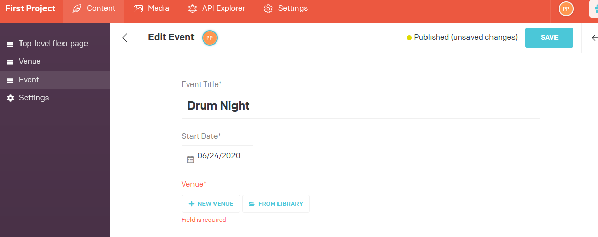
I didn’t explore DatoCMS further because:
- The free plan is limited to 200 objects,
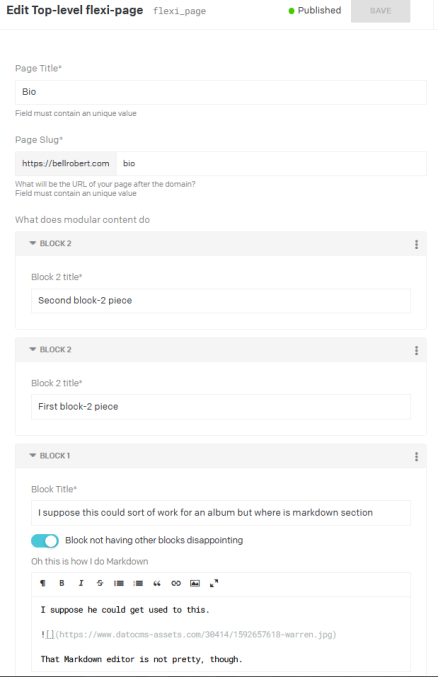
- I couldn’t figure out do a “block” (an object-ey collection of fields/things) within a “block”.
- That’s a dealbreaker for building up complex flexible “page arranger” interfaces to help simulate that “Squarespace experience” with page components.
- This was the closest I could get:
Forestry
Although I don’t see a number of users on the pricing page, I believe I recall being able to set up an “author-only” account for a project as well as an “editor” account on the free plan.
As a Git-based CMS, “internal backup” is easy and “migration backup” of content, which is .md file front matter, is too.
Schema configuration is through a graphical user interface, which drastically lowers bus factor. However, because it’s a Git-based CMS, the schemas become structured plaintext files in your Git repository, which make backup easy as well.
That backup could be important, because free-plan sites only stay alive for 3 months, and honestly, I’m a little nervous my content author might fail to edit the site even that often.
Forestry requires you to have a template property in each object of the YAML in your .md files that you’re using it to manage, which may not be what you would’ve chosen to call it. I don’t see a way to auto-populate that field from another field of your choosing, either. I’m getting really picky now.
Basically, if I wanted to make sure that .md files are portable to CMSes that, say, use a layout property instead, I might want to make a content author do some duplicate data entry.
Forestry lets me nest objects to my heart’s content and makes editing deeply-nested objects and rearranging arrays of objects look perfectly intuitive enough in the user interface, which makes it possible to build flexipage-type content.
Unlike pretty much every other CMS I’ve played with, there’s no way for an author to toggle a rich-text editor between “rich mode” & “code mode” while editing if that editor is storing its data in the front matter of a file. This makes it a little difficult to let authors quickly embed a 3rd-party widget in their code (I think I’d have to wrap “rich editor” & “code editor” in sections and tell an author to add back-to-back sections together … which could mess with inter-section spacing on the front end in ways I’d rather it not). Shame – I hate having to “give people instructions” on how to use a tool. I’d rather it be obvious.
Forestry hosts itself (unlike Netlify CMS, which tacks onto the built website’s hosting) and previewing works quite smoothly, whether with a JavaScript-templated SSG or a more traditional “pure static” SSG.
According to Frank Taillandier, that’s because:
Behind the scene, Forestry.io clones your branch in a container and runs your custom serve script.
And if your SSG has some Hot Module Reload built in, you can take advantage of that.
Hugo builds are so fast that previewing is done in less than 3s, 11ty is using browsersync so eleventy –serve is also pretty fast.
Other SSG like NuxtJS, Gridsome or NextJS have fast-refresh and Hot Module Reloading. The main point here is being able to preview before you save.
I’m a little afraid of being vendor-locked if prices go up, but considering I might be able to have Netlify CMS configured as a “plan B,” I can probably live with that risk.
I really wish I could get toggle-able text block editors for front matter, though, to avoid rigging up weird data structures that have to do with the CMS, not my site model. Honestly, that is the number one thing keeping me from jumping straight into Forestry without even finishing this blog post.
Kentico Kontent
Kontent’s user interface seems intuitive for content authors.
Layout is optimized for medium to large screens, not mobile.
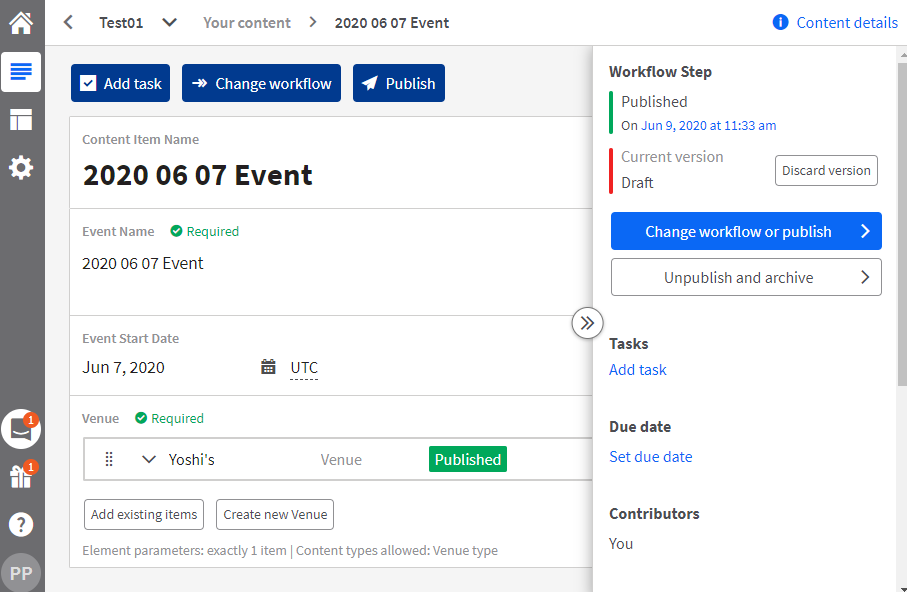
Its “create new venue from within an event” UI works well … except that it forgets to make it obvious how to get back to the event you were creating when done. You’ll have to teach your content authors to follow the breadcrumb back at the top.
I didn’t explore Kontent further because:
- The free plan is limited to 500 objects and
- It seems you can’t easily import historical data into the system without paying.
- I suppose you could upgrade-import-downgrade, but I kept looking.
Magnolia
[[[TO DO:]]] WRITE ME
Netlify CMS
Free and open-source, so as long as your content author can find developers to help them, like a Wordpress installation, it can “live forever.”
As a Git-based CMS, “internal backup” is easy and “migration backup” of content, which is .md file front matter, is too.
Content models are based on structured plaintext configuration files, with no graphical user interface the way Forestry offers, so “bus factor” is somewhat high if you’re not used to writing YAML, JSON, etc.
Because it’s a Git-based CMS, schema files get backed up along with the rest of your web site however you back up your Git repository.
Monica Powell clued me into the fact that its rich text editor is configurable with “sub-widgets,” as I like to call them.
If you use a static site generator whose templating is based on React/JSX and that supports MDX, it looks like it’s not too hard to render an in-CMS live preview of the way a rich text section would look once “sub-widget” components have been embedded in it.
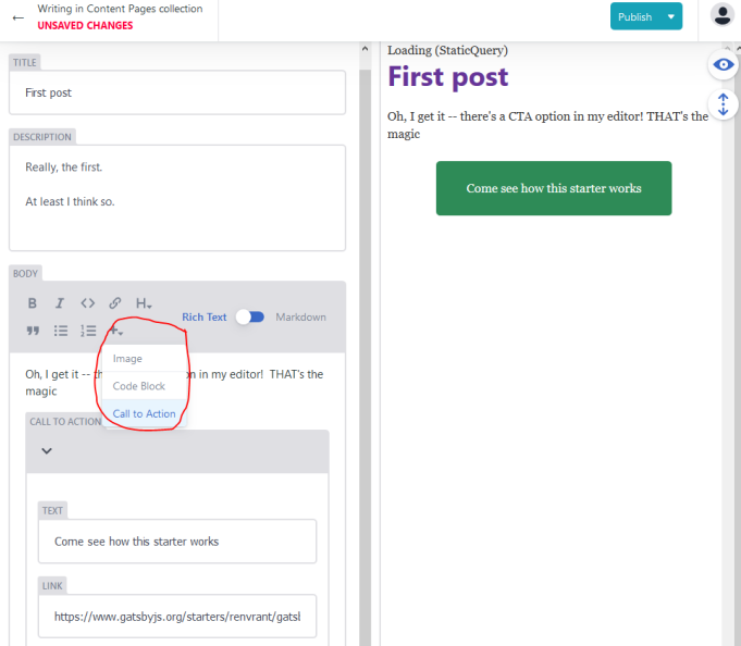
It occurred to me, in looking over some Netlify CMS / MDX example code, that this “React component reuse” between an SSG and a CMS might be one reason so many people structure their Sanity Studio configuration code and static site generator configuration code in the same Git repository. It feels obvious when I look at Netlify CMS’s codebase that lives as a sub-folder of SSG configuration code. But I’ll bet it’s the same idea.
I also think I haven’t quite explored its “previewing” functionality deeply enough.
I think it takes some work to set things up correctly, whereas Forestry kind of … does the hard stuff for you … but if you host on Netlify, I’m starting to think that you can have pretty much the same “near-instant previewing” experience in Netlify CMS that Forestry gives you out of the box. I don’t think Netlify CMS is just giving you a place to punch in a link to a running “development” server. Rather, I think it’s willing to spin up its own “development server” pages for you. Just … again … with more work. Plus, that sort of still vendor-locks you to hosting on Netlify?
Prismic
The price is right, though, with unlimited API calls and documents.
However, I found Prismic’s UI “overbearing” for a non-technical user.
It has a strange invisible-form-field user interface that requires a user to sort of … guess … where to click in what looks like a Word document.
I didn’t explore Prismic further. I didn’t like the UI.
Sanity
Sanity’s user interface is “perfectly respectable enough” (if a little boring in black and white) – but it’s extremely intuitive, and its performance on mobile makes up for its lack of pizazz.
It lets me nest objects to my heart’s content and makes editing deeply-nested objects and rearranging arrays of objects look really intuitive in the UI, which makes it possible to build flexipage-type content.
The CMS looks fantastic on mobile (although you can probably break that by over-tinkering with it, which they let you do), except for rich-text editing. At least on Android, rich-text block editing interacts very badly with the keyboard. But even drag-and-drop of components works well on mobile. I recently showed off a real-time live preview of a Gatsby Cloud preview instance reacting to Sanity Studio changes on a pair of smartphones.
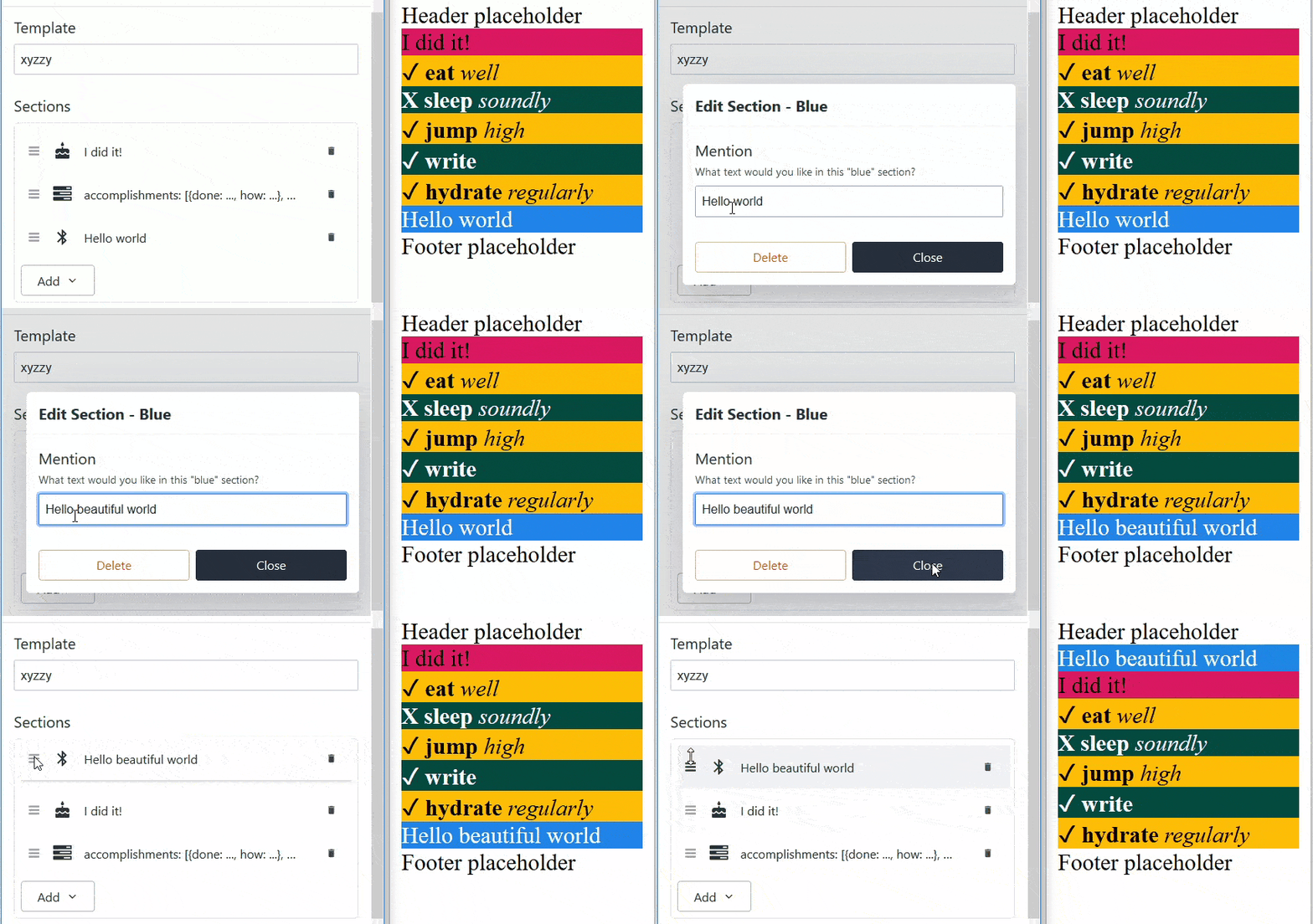
Its rich text editor is configurable – I can add a “YouTube embed” button that takes a YouTube URL as input and does all the work to generate “embed” HTML in the background, but that shows a cute little placeholder, saving authors the work of hand-embedding “embed” codes. Plus, as a developer, I get more control over how I render the YouTube (e.g. loading a screenshot with a play button instead of a player until it’s actually clicked), which is good for performance, which is good for SEO.
Of course, once I’ve stored all this nifty “custom YouTube embed” stuff into Sanity, I’m a bit vendor-locked.
Sanity allows 10,000 records on the free plan and doesn’t count components that only exist as page elements against that limit.
Unfortunately, Sanity does not have a UI for editing the schema point-and-click rather than with code.
Worse yet, editing the schema requires installation of a Node.js-based command line tool on your hard drive. The “admin” bus factor is rather high.
Although Sanity works beautifully with Gatsby Cloud previews, I haven’t yet found a long-lived “Gatsby develop” free hosting solution to provide “instant preview” functionality for Sanity that’s “always there” for Sanity. I got Heroku working, but as soon as I publish changes, the preview reverts to the pre-edited look (because Gatsby needs to formally rebuild – but Heroku doesn’t want to do that without completely restarting the server – a slow process), which is confusing to content authors.
I had the following conversation with Knut Melvær about basically having 2 “built” environments (1 public; 1 secret) that might work with future changes to Sanity’s webhook offerings, if they get released in the free tier:
Knut: You can also do the same thing that Forestry does on Netlify (or whatever) with a preview branch that has a token to access drafts.
Katie: How would my instance of Node, responsible for hosting
https://preview.mysite.com, know that it’s time to have 11ty fetch fresh data from Sanity’s drafts endpoint? What would the “listener” be and what would need to be configured to ping it?Knut: In this case, you wouldn’t need to run Node. You’d just trigger a rebuild (npm run build ) on your hosting service that needs to support webhooks, i.e. to trigger the build on an incoming API request that Sanity sends whenever a change has been made.
Katie: Ah – so … I’d send a webhook fire to “build” on a “production”-type 11ty site that isn’t actually meant for more than 1 person? And I’d fire the webhook every keystroke?
(Is there a way to make Sanity slightly less webhook-happy? For example, upon some sort of “save draft for preview” button only?)Knut: Improved and awesome webhook support is on the roadmap. But yes, the typical approach to preview of SSGs is to make a preview-environment that builds from a preview branch (if files is the source) or has certain access to drafted content.
Katie: Okay. So in that case, if I wanted to use API-based CMS and not Gatsby as an SSG, Hugo might be a nice SSG because it’d potentially update the fake-preview build the fastest?
Knut 11ty is pretty fast as well!
Stackbit
I’m crossing my fingers that Stackbit could be the free-tier silver bullet for me when all is said and done.
Back when I first wrote this article, I wrote some words about it being “not ready,” but I think it was actually just that I hadn’t yet figured out how to master composing a stackbit.yaml file to accomodate a custom theme. Also, I think I had bugs in my theme that kept it from updating properly in serve mode on my local machine, which is all Stackbit’s live-preview engine is running, so my buggy code was producing a buggy user experience.
-
I love that it has the same kind of “in-CMS preview hosting” for simpler SSGs like Jekyll & Eleventy that Forestry has – only you don’t even have to click “preview” & open a new window.
-
I love that it has the same kind of “your page inside an editor toolbar” feel that the most basic version of TinaCMS has – only without injecting itself into your SSG template files.
Plus, it plays well with more traditional “headless” CMSes like Netlify CMS, Contentful, or Sanity.
- You can make it a “bonus CMS” if you’d like to simply take advantage of its in-page editing. Watch Stackbit’s CEO show Chris Coyier side-by-side editing of the same site in both Stackbit & Contentful from 27:44-28:49. Use cases:
- Content authors could leverage Sanity’s simple mobile-editing UI from an airplane in an emergency, but enjoy Stackbit’s WYSIWYG feel from their desktops.
- Content authors can make WYSIWYG-style edits in Stackbit, sharing the mobile preview links with colleagues and such while making the edits. Then they could … I believe? … have their managers approve them through a complex approval flow in Contentful.
- You don’t have to type every detail of your data model all over again into
stackbit.yamlif you’re migrating, or if you’re just dipping a toe into the water and testing it.- Stackbit Studio is really good at understanding Netlify CMS schemas, Contentful schemas, etc.
- Pretty much the only thing you have to hand-type into the
modelsproperty is a mapping of the correlation between anypage-typed content types and theurlPathto which they render. This lets Stackbit present an editor for the correct URL when you create a brand new page. It also helps Stackbit identify the data behind the page you’re currently editing, which helps with duplication and other details that make the visual editing experience go smoothly.
Along the way, I hit a few snags where I couldn’t completely get something working with a custom theme – and then the company helped me debug and updated their documentation accordingly. So if you try Stackbit & get stuck, be sure to reach out to them, too.
The one caveat I’ll give you is that if you’re using Stackbit while your SSG theme itself is still under heavy development, you might want to consider using it alongside an API-based CMS for data storage, rather than storing your data into the same Git repository as your theme’s codebase.
This is because Stackbit handles “draft” vs. “published” content in Git-based content storage by forking your theme into a new Git repository and having it have a main and a preview branch. If you need to update the background color of a <div>, you now have to update it in two branches, not one, lest content authors get confused why previews & live sites look different than each other.
Stackbit will still fork your SSG theme into a new repo even if you use it alongside an API-based content store like Contentful or Sanity, but at least now you only have one branch on which to update the background color of that <div>.
TakeShape
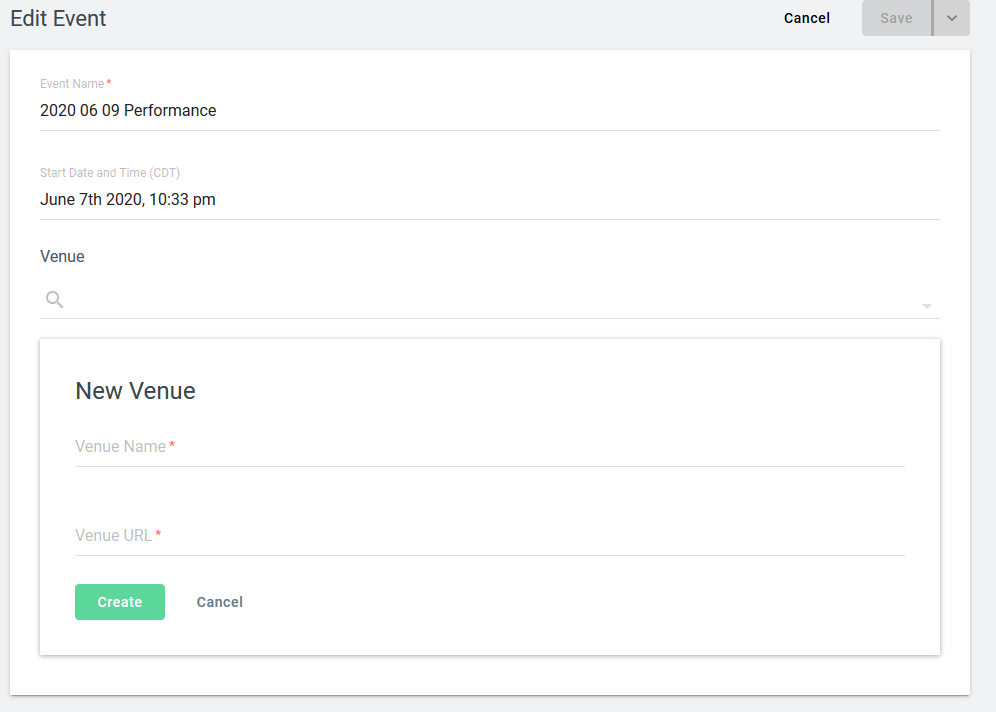
TakeShape is attractive for users, although be careful with non-required fields on objects you point other objects to: they don’t show up in the quick-create.
In other words, if a “venue” has an optional “location” field, a user can’t fill it in when quick-creating from an event.


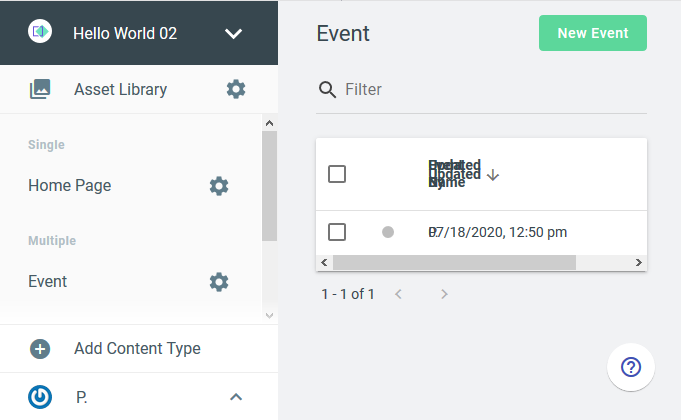
Also seems it doesn’t look amazing on small screens.
Limited to 500 content entries on the free plan, and the quick-create quirk was a bit of a dealbreaker too, so I didn’t explore TakeShape further.
TinaCMS
As a Git-based CMS, “internal backup” is easy and “migration backup” of content, which is .md file front matter, is too.
However, with schema definitions typed directly into SSG template files, “migration backup” of content data models is not easy.
This mixing of content data models and SSG templates also obliterates any hope of ensuring CMS administrators can’t accidentaly break SSG templates while editing CMS schemas.
Content models are code-based, not GUI-configured, so “bus factor” is high. It’s not easy content-modeling code for me to write, either (React, not YAML or JSON).
TinaCMS injects JavaScript into production builds by default (even when allegedly turned off in production), which lowers Lightout page speed scores. You have to learn to manipulate Webpack to eliminate the excess JavaScript.
That said, it’s probably about as Squarespace-like as a CMS for static sites gets.
Authors literally double-click actual components in their web pages and type.
Being Git-based, data limits aren’t an issue. Data lives in the same Git repository as SSG template and configuration files.
It’s free and open-source, so as long as your content author can find developers to help them, like a Wordpress installation, it can “live forever.”
Perhaps I’m misunderstanding things, but I believe that like with Sanity/Gatsby sites, the problem with “live preview” is that you have to find a long-lived environment in which to run your “Gatsby develop” process.
(Maybe not. If it’s just adding a browser-based skin to your web site, perhaps you can basically run a “second built site” that has “editor” settings turned on and that writes to a repository that, under certain “publish” circumstances, gets its changes swept over to your “real site.” I haven’t gone deep into TinaCMS.)
I’m shying away because I think TinaCMS might be slicing bread with a chainsaw for my author. I don’t think I need my user experience quite that Squarespace-like? At least not at that intensity of admin work and that high of bus factor.
Conclusions
Of course, my research will be out-of-date by the time I hit “publish”. (A month after this post’s first draft, Contentful jumped onto my shortlist by increasing free-tier record limits from 5,000 to 25,000.)
As of initial publication, Sanity, Contentful, Forestry, and Netlify CMS are on my shortlist, with Stackbit on my watch list.
Test some CMSes and let me know what you love in the comments.
P.S. Thanks to Chris Biscardi for the title that makes me smile every time I see it!
